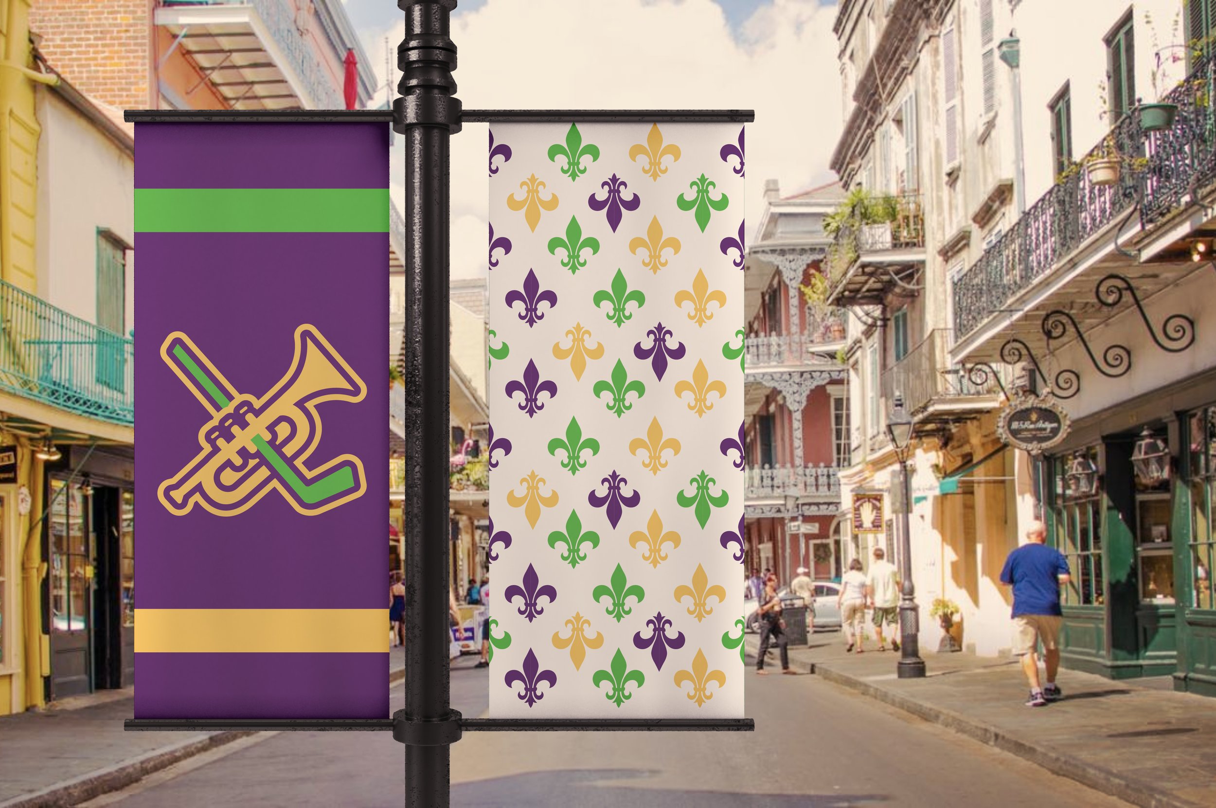
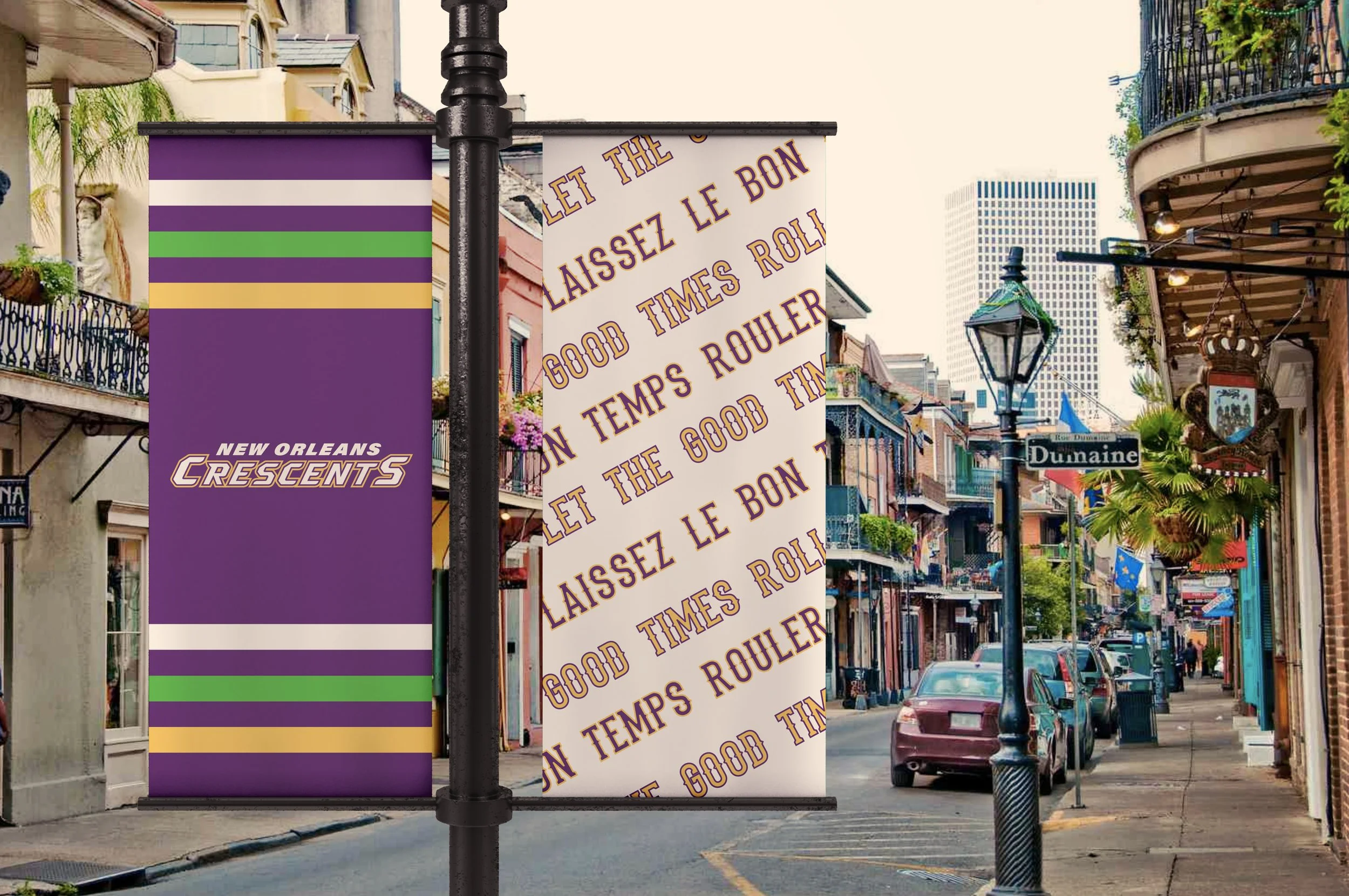
The New Orleans Crescents are an NHL expansion team representing the liveliness and rich history in this city. The Crescents were designed based on colors and patterns that are easily recognizable with the city, location, and history.
New Orleans Crescents
INSTRUCTORJOE BOSACK
INSTITUTIONTyler school of art architecture
New Orleans is a city like no other. The history runs deep, and it is something that the natives proudly represent. As the home of Jazz, Creole cuisine, Mardi Gras, and Bourbon Street, New Orleans keeps Louisiana rumbling. The city already has an NFL and NBA team representing their city and they deserve another. Hockey is a loud sport filled with high intensity and passion, which is a perfect sport for New Orleans. Fans will pack the arena creating a vibrant atmosphere cheering on their new team, the New Orleans Crescents.
Wrought iron pattern, inspired by wrought iron fencing seen throughout the city of New Orleans.
The colors are inspired by Mardi Gras, the most well known festival celebrated heavily in New Orleans
The city’s slogan, in English and French because New Orleans was colonized by the French.
Star pattern seen in the logo and throughout the brand.
The team name is inspired by one of the city’s many nicknames, “The Crescent City”. New Orleans is called the Crescent City because of the crescent-like shape the Mississippi River makes when running through the city. The town was founded about 1718 by Jean Baptiste Le Moyne, Sieur de Bienville.
I wanted the numbers to relate with the wrought iron pattern you see throughout the team branding as well as bold typefaces used for the word mark and text to mimic the typography used on real professional sports teams.
PRIMARY LOGOSECONDARY LOGOWORDMARK“Laissez le bon temps rouler” is French for “Let the good times roll” which is the city’s slogan.


